Perliminary task brief:
"using DTP and an image manipulation program, produce the front page of a
new school/college magazine, featuring a photograph of a student in medium close-up plus some appropriately laid-out text and a masthead. Additionally candidates must produce a mock-up of the layout of the contents page to demonstrate their grasp of DTP.”
The Main Task
The front page, contents and double page spread of a new music magazine.
All images and text used must be original, produced by the candidate(s), minimum of four images per candidate. To be produced individually.
As you can observe from the two briefs the main task is a lot less specific, this gave me the chance to be alot more creative in my ideas. During the entire process i have learnt many things below is a list:
Research was extremely different between the perliminary task and the main task. The perliminary task involved minimal if any research, so the only thing i did look at was a few existing student magazines and thats as far as it went. But for the main task i looked in to shared features of similar magazines, publishers, forms and conventions and even into adorno's theory. All of these helped me gain the knowledge needed to create my final peice.
I also went about planning the two pieces differently, for the preliminary task i did no planning at all - it was all just trial and error until i found a piece i was happy wit hh. However with the main task i had already researched forms and conventions and shared features i then went onto create several different layout templates this meant when creating my final piece i had an idea of what i wanted to do, and by doing this i managed to save time and created a magazine appealing to the correct audience.
Once i had finished the planning and researching the next step was taking the photographs needed for the final pieces, for the perliminary task i speant one hour maximum (one lesson) just wondering around college with a camera taking photos of the college and a few of my friends. There were no real logistical arrangements or planning behind it, this was my first mistake. This was because when i came to use my photos i realised id got a very small amount of photos that could be used. this created limits to what i could do with the perliminary task. so for the main task i did the complete opposite to this i planned when where and who were going to be in my photos, and had several different shoots planned this way i new that i would have more images to choose from meaning i could be more creative when producing my final piece.
When it came to creating my magazine the skills i learnt in the perliminary task really helped me, although my knowledge wasn't great i still had a sufficient amount, and the more i used certain software the more i learnt.
Overall i feel that i have learnt a great deal in the progression from the perliminary task to the main task both in my knowledge of media and in my software skills.
Tuesday, 21 April 2009
what have you learnt about technologies from the proccess of constructing this product?
Production (hardware skills)
When i had formed my idea for my final piece the first thing i did was to take the photos to use for the magazine cover and spread. I used a dslr camera for this and all of the images were taken within a photography studio. The camera used was my own so i already knew how to use it, however the studio within the college has recently gone through a refurb and was boasting a variety of different backgrounds, lights and various other equipment that i had never used before. I needed to become fammiliar with these new editions to the studio quickly and aptly to achieve good photographs. After a few test shoots i found a setup i was happy with and discovered how seperate lighting creates different moods within a picture. For my main cover photo the lighting is quite dark as i wanted to achieve a fairly serious mood and i wanted the features on the face to be more obscure than usual, then there is an element of mystery and the model looks more like a rocker.

In the picture of the girl i aimed to soften the lighting but not make it so bright that her facial features cannot be vividly seen.

I felt the use of lighting really helped me photos as they create the mood that goes with them. The lighting is also whats responsible for highlighting the props and features within a picutre so without the use of lighting nothing would prominently stand out.
Post production (software skills)
The next thing that i used was photoshop, this was to edit my images, although i had used photoshop before it had only been for very basic things nd my knowlegde wasn't up to an adequate standard i felt for these photos.However after a lesson from my teacher on how to polish the photos to a professional standard i got to work on my own, this proved to be very time consuming aswell as frustrating but after a number of attempts i finally masterd the technique to a standard i was happy with. This was a very accomplished feeling and gave me enthusiasm to make more effort with each photo.
Finally i was to piece together my magazine using quark express. This proved to be very frustrating as i have only used it once before and that was on the prelimnary task so getting it to do what i wanted was difficult. The main problem i encountered was getting the text where i wanted it as i had yet to discover how to do it properly. However after a few more lessons when i had gathered research on how to successfully work this programme it became easier and i finally was able to achieve the look i wanted.
who would be the audience for your media product? how did you attract/address your audience?
The target audience of a music magazine is people with a special interest in this case wanting to learn to play the guitar, the audience profile for the consumers are that they will most likely be a succeeded, aspirer or achiever or a combination of these. This means that they are driven, ambitious successful, and want to better themselves. They will be post materialists in that they want 'to be something later' because of the nature of special interest groups they can rate anywhere within the jicnars scale. Special interest groups are a demographic no matter what the audience’s age. According to the life stage categories they will come under either decision pending, in that they have no idea what they want to do with there life, or have career commitment, in that they know what they want to do and are going to go out of there way to do it. To sum all of this up I would say:
"its for anyone who wants to better themselves, they know where they want to go and what they want to do, but still aspire to the greater things in life, they are confident in what they do and enjoy doing it."
Once i had established my audience and created the magazine i then went out and tracked down my target audience armed with a questionaire, copies of the magazine and a camcorder, to see how effective my final piece was. below is a copy of this questionaire.

comments back from the questionaires include things like " i really liked the way it was easy to read and how key elements grabbed your attention."
when i asked a girl what she liked about the magazine she said she "enjoyed reading the article about Kelly T" this is unsuprising as this was the double spread i graphically dedicated to the female proportion of the magazines audience. I then asked if the reason she enjoyed this aspect of the magazine was because of the genre that was used and she replied that it was as she herself is interested in music. This successfully proves that this genre of magazine appeals to both genders equally and that i have laid it out in a way which doesnt just interest one.
All people replied yes to the first question, which meant i had fulfilled my criteria of publishing a front page which grabbed the attention of the public and managed to quickly and aptly display what it was about.
When asked about whether the final piece was a believable result to be a genuine and authentic magazine people replied that it was. This was because of the added details i included such as the barcode and price. Another person said that they thought the font inparticular was reminiscent of a music magazine. However a few people thought that some of the photos didn't look that professional but i had limited resources.
Over half the people i asked question five replied that the bold fonts were particularly effective. I was hoping that the photos i took would've grabbed more peoples attention but i don't think that they were to a high enough standard.
Overall i think doing this questionnaire was very helpful to getting to understand what people liked about my magazine and where i went wrong. This way i can know what techniques to use and leave out next time if i try and achieve this again.
what kind of media institution might distribute your media product and why?
After researching publishers and what they do, aswell as the publishers of similar magazines i believe that my product will fit in within the media world and has the potential to be owned by a major publisher. Whilst i was researching a large majority of similar magazines were all owned by future plc, this suggests that they have a basic interest within this area, however more research into future has lead me to find that they are owned by Pearson plc, another horizontally integrated media conglomerate who own such publishers as penguin. Which leads us to the question of whether it is actually about peoples interests or whether it is all about profit, and the evidence shows that it is more aimed at making profit than anything else. so it is this company or one of simmilar value that i think will distribute my magazine.
Future plc is owned by a major media conglomerate so their main interest is going to be income, given the type of magazine this is i feel that there is alot of potential to make money through advertisement, making it even more appealable to publishers. The speciality of this magazine is learning a new talent and educating people on different aspects of the guitar as well as being informative about popular bands. There is a large market for this kind of topic at the moment as the guitar is appealing to people of all ages. I think this is why people especially publishers and those working in the advertising industry will be interested in my product. There is a lot you can do to promote this magazine and to help it sell better it could even be suggested that you get something free with it. There are many different ideas that can be branched off my central focus of producing a magazine for guitarists and wannabe guitarists.
Although i have only designed a magazine there is potential for the idea to be put in place elsewhere for example you could create a website turn it into an ebook or even create merchandise, each of these coming with there own benefits all of which are financial. This variation of merchandise also makes the product more appealing to a wider range of people, for example children or those not keen on reading will appreciate the ebooks. This means perhaps people will start learning about the guitar from a younger age and therefore become more advanced quicker in their life. Website are something universal and easily accessible, it is also a lot less effort to type in a web address than it is to go out and buy a magazine. Therefore this could also be a good idea for my magazine to transform into in the future.
how does your media product represent particular social groups
When forming my end product I was very conscience of the audience that i was trying to appeal to. I wanted this magazine to catch the attention of the younger audience, and so attempted to make the cover and pages more inticing to the younger generation's eye. This is because it is more likely that younger people will be more willing to want to learn guitar. I don't want to make the magzine look too immature though as people in thier 20's would still be interested by the prospect of learning how to pla the guiatr.I kept the layout for the front cover quite simplistic and informative as teenagers with a short attention span are just going to glance at covers hoping to be interested by a title or article within the magazine.
I think that my cover represents dominant ideology as it features is a man with a guitar, and the fonts and styles used are typically recogognised at being aimed at men. They're big, bold and catch your eye. Not much attention has been paid to making them appear attractive as these fonts are designed to inform. The man featured on the front cover is displaying typical male attributes as well, he appears aggressive and controlling by his facial expressions and body language. He is violently grabbing the guitar and assuming an authoritive pose. The background is black and some of the text is red, these colours are very threatening and masculine. It wasn't a direct aim of mine to make this cover particularly appealing to the male majority of a teenage audience but the devices i used have done so.
The centre spread represents emergent ideology in that it is aimed more specificly at women, this brings forward the idea of women being equal to men and how they can do everything men do. Men would always be thought of as the more active of the genders, and women were the figures that stayed home. Playing the guitar is something that used to be a fairly male dominated talent but now more and more females are becoming interested in adopting this skill. Guiatr players are normally dominantly represented by men and there has been an absent representation of the portrayal of women in this field. I think it is important when making a magazine about a subject which is becoming more neutral amongst the genders to make the spread appealing to both men and women as well.
In terms of trying to appeal to people within a certain class system i have tried to make the magazine fairly universally appealing. The models i have used are your every day teenager or young person in general, they're wearing simplistic clothing and don't posess anything glamourous in the photos. The models look ordinary and make the magazine more appealing to people as they can easily imagine themselves being like these people.
in what ways does your media product use, develop or challenge forms and conventions of real media products
Looking at tuition magazines I have discovered a few similarities within them, the magazines i have looked at are total guitar, guitar techniques and guitarist. the similarities are endless, the first main point is that all 3 magazines are published by future plc.
In terms of the structure and layout of the magazines, they are all the same. The font type for the mast head is very similar this being a white serif font. The images used may look different as they are of "different bands" but they are still all the same full body shot photos with the front man holding a guitar. the overall layout is very similar with the screamers, main cell and cover lines all being placed within the same spaces for example The main sell is placed to the left hand side of the cover and is in the same font and colour as the mast head, making it as much of a focal point as this and this is the same on all the magazines, its almost as if the covers for all are based on the same template and the only difference is the bands within them. so it is this template that i have attempted to follow
however there are times when i feel it challenges the forms and conventions usually used, according to Susan Haywood genres are not static but shifting and slippery, evolving over time. And this is exactly what i feel my magazine is doing. for instance for the masthead i have used a combination of both serif and sans serif fonts within the masthead, which is rarely if ever seen within the type of magazine that I am producing. The reason I used both is because generically serif fonts are aimed at the older more mature generation and sans serif fonts are aimed at the younger more modern generation, and i felt by mixing the two it would create slight controversy but at the same time produce a magazine that is aimed at a wider audience.

Secondly I have designed my centre spread to appeal more to the female audience. I have used particular techniques like choosing a font that has feminine attributes such as appearing thin, delicate and neat. The lighting is softer and the model displays signature female qualitites yet striking quite a masculine pose. I think this challenges the normal conventions of males dominating the music industry. In this picture the main focus is the girl who is positioned in the centre of the double spread. Her costume is fairly simple, but her sunglasses become a proiment feature and are therefore more noticable in contrast with her feminine face.

On the contents page i have used the same font as the front cover so carry on the continuous theme. The pictures i have used are both of males but in different stances, one is relfective and calm and the other is frustrated. the first frustrated/ angry image is simmilar to that to how you would expect a man to be portrayed (dominant ideology) the second however is alot more calm and some would say the man is in quite a camp pose. this represents emergent ideology within the 21st century of the "new man" who is in touch with his sensitive side, and it is this image that i feel challenges the forms and conventions of other peices of simmilar media.

Wednesday, 18 March 2009


Tuesday, 17 March 2009
music magazine: logistical arrangements
over half term i plan on taking the photographs that i need for the coursework. the equipment needed for this is stated below:
*DSLR Camera
*Tripod
*photography studio
props needed:
*guitar
*models
all the equipment above i have readily available to me other than the studio, so in order to take the photos i need to arrange a time both the studio and models are available. to do this i have got a list of when the studio is free and im going to get the models to say when they can make it, and if needs be i will take the shoots over a number of different times.
i have recently completed the photoshoots that i have said that i wanted to complete above. so far i think that they have all gone well, however they did take longer than i anticipated and there was one shoot that didnt quite go to plan, and the final image is not how i wanted it, this was the shoot for the cover so i need to go out and re-do it. i think this time i will use different lighting within the studios as the images were to dark, hence the re-shoot.apart from this i think i have got a few good images that i will be able to use within the spreads.
music magazine: shot list
there are a number of shots that i would like to get for this project, i want to take a few different shoots so that i am not stuck using the same images over and over.
for the front cover i would like to take a medium close-up of one of my friends holding a guitar. this is to create the idea of the model being the frontman from a famous band. this idea i have taken from the total guitar cover.
the shot itself i will take in the studio at college givung the photograph a plain background, and i will then be able to take the image and edit it in a number of diferent ways to achieve the look i want, and by keeping the background plain the image wont look to over crouded on the cover.
for the contents i plan on using a simmilar image to the one from the cover, this way i can link the contents to the cover. i will also use a number of other images, a selection of these i am going to take of people playing instruments in the streets (buskers) so i can link this to an article. i am also going to take some more of friends in the studio and make them look like a band photoshoot. these images will also link in with my centre spread article and be the main images for that helping all three pages to link in.


Monday, 26 January 2009
music magazines: summary of research
After completing initial research into music magazines I have now decided the sub-genre of the music magazine I am going to do, this is a "guitar tuition" magazine. There are a large number of magazines that are in this sub-genre, of which my magazine will be similar to. These are such titles as total guitar, guitar techniques and guitarist.
Looking at other similar magazines has helped me to find the right target audience for my magazine. There demographic will be that they are most likely male. According to the jicnars scale they will most likely be b1 or c1 so slightly upper class. There psychographic will most likely be aspirers (somebody who wants to better themselves.) and there age range will be between 16-26.
This audience will affect my magazine a lot, specifically because the age range is so wide, this is due to the fact that the magazine is aimed at people learning to play the guitar, and there is no specific age for this as it can be done anytime. The content of the magazine will all be based around guitar playing bands from the past and present, as well as beginner through to expert lessons, this will encourage people of all ages and levels of ability to buy the magazine.
With regards to the actual layout and style of the magazine I aim to produce a very modern spin on existing magazines but still keeping that raw and rough look that comes along with playing the guitar.
I aim to use colloquial, non Standard English (slang) language to help my audience to be able to relate to the magazine.
For the representations in the magazine I plan on using band members or the "cool" older brother type figure within my magazine, to help promote the idea that if you play guitar and learnt certain songs you will be in a band or that "cool" older guy. I plan on using a number of different close up and medium close up shots, maybe at canted angles all to generate the idea of being cool, different and individual. The location for these shoots are going to take place in a number of different areas, this is within the studio, abandoned places covered in graffiti and at gigs.
This is all to help generate the idea that this cool individual living is what is associated with guitar playing.
Monday, 19 January 2009
music magazines: initial specific research into shared features
during my research into the music magazine industry i have looked at the forms and conventions of music magazines, the publishers of the magazines and institutions. i have so far been able to keep up to date with this research and have recently chosen the type of magazine i wish to produce, this being a guitar magazine, and more specificaly a guitar tuition magazine. i have chosen this as i feel that it will challenge me to do something out of my comfort zone.
looking at tuition magazines i have discoverd a few simmilarities within them, the magazines i have looked at are total guitar, guitar techniques and guitarist.
the simmilarites are endless, the first main point is that all 3 magazines are published by future plc.
in terms of the structure and layout of the mags, they are all the same. the font type for the mast head is very simmilar this being a white serif font. the images used may look different as they are of "different bands" but they are still all the same full body shot photos with the front man holding a guitar. the overall layout is very similar with the screamers, main cell and coverlines all being placed within the same spaces for example The main sell is placed to the left hand side of the cover and is in the same font and colour as the mast head, making it as much of a focal point as this and this is the same on all the magazines,
its almost as if the covers for all are based on the same template and the only difference is the bands within them. so in order to create
the pschographic for all 3 magazines will most certainly be succeders (somebody who wants to better themselves or there life)
given the area of the magazines (guitar tuition) they will all come under special interest groups within the life stage catagorie.
after looking at the 3 magazines i have learnt that there is a specific pattern of design to follow for this type of magazine seeing as all 3 use the same. this has helped me come one step closer to producing a guitar tuition mag to a very high professional standard as i am now aware of the forms and conventions of this type of magazine, and i believe if i stick to the basic rules and patterns of the magazines i have looked at there is not much room for error.
Tuesday, 13 January 2009
Music Magazines – Institution
Whilst researching publishers and what they do, and the consequences of the publishing structure that is used I have come across Adorno.
Adorno suggests that the culture industries generate formulaic, simplistic, emotional products.
these products from the culture industries then create a false need within the audience. These are needs that can be created and then pleased by the capitalist system. This is true of NME the magazine that I have looked at previously, for example NME is a magazine aimed at “cool” teenagers, who would essentially by the magazine to make them look “individual” and “edgy” the magazine itself contains interviews from bands, as well as adverts for new albums. This may generate in the audience the desire to purchase albums by bands within the magazine to keep up the so called “image” that comes along with being “individual”. People therefore continue to work, to earn enough money to buy the albums and merchandise that will allegedly make them happy and keep up there “individuality” and therefore put all of there money back into the hands of the ruling classes
Adorno also argued that culture industries have developed some sort of technological inventions that help to control audiences thought.
According to Adorno music and media can be characterised by standardisation and pseudo individualism.
For example if you take, the kooks, arctic monkeys and the view they are not only generically similar to each other but also to indie bands of the past. Each group may have ‘a unique selling point’ but they are essentially the same.
Tuesday, 6 January 2009
Music Magazines: Initial Research – Publisher
to help get more of an idea of what goes into the creation of magazines i have done some background research into publishers and what they do and how they work.
A magazine publisher makes literature or information available for public view.
Traditionally publishing refers to the distribution of printed works, for example books. But due to the growth in technology and the use of the internet publishing has been extended to include e-books, websites and blogs as well as a number of other things.
the concentration of media ownership as a whole refers to a large number if not the majority of media outlets being owned by a small number of conglomerates and corporations, some of which that are owned by more corporations. A good example of this is NME, NME is owned by ipc media along with a large number of other magazines, and then ipc media are then owned by time Warner. This is evidenced by the ownership/ publication of NME. NME as a magazine is seen as a statement of individuality to all of its readers, however this individuality is short lived when you realise that NME is owned by IPC media along with such titles as horse and hound, caravan and nuts. This wide range of magazines aimed at all sorts of audiences raises the argument as to wether NME is just another magazine used to sell a specific audience specific products. This idea is then strengthened if not confirmed when you see that IPC media is owned by time Warner who own a number of record labels. And it makes you wonder as to how much marketing and advertising time Warner place within NME to sell more of there products to maximise profit, which may raise concerns as to the integrity of the brand “NME”.
This is the same with the magazine that I have been looking at “metal hammer” metal hammer as a magazine is owned by future plc, who also own a number of other music magazines of a similar genre as well as a large number of gaming magazines. This suggests that they have a basic interest within these two areas, however more research into future has lead me to find that they are owned by Pearson plc, another horizontally integrated media conglomerate who own such publishers as penguin. Which leads us to the question of whether it is actually about peoples interests or whether it is all about profit, and the evidence shows that it is more aimed at making profit than anything else.
Music Magazines: Initial Research – Forms and Conventions
for my as media studies coursework i have chosen to do 'print' for this i will be researching and then finally designing my own music magazine.
Below I have analysed two different music magazines one called "Metal Hammer" and the other called "total Guitar" i have done this so that i have an idea of what different magazines use to appeal to there target audience and to see what i should include in my final peice to create a realistic interpretation of a magazine
During the lesson I have looked at the:
• Genre of music Audience (demographic and lifestyle)
• Form and Conventions: Cover
• Form and Conventions: Contents Page
• Types of double page spread in magazine
• Form and Conventions: Double page spread
• Publisher
Of "metal hammer" and "total guitar"
The first magazine I looked at was metal hammer. This magazine is aimed at people with a special interest in the subject matter in this case “heavy metal”. Special interest groups are a demographic no matter what there ages. You would probably describe there psychographic as “Radical” – somebody who’s rebellious/ different from mainstream. People in this special interest group could rate anywhere on the jicnars scale.
There are a number of different connotations within the front cover which help it appeal to its target audience when you first look at the cover the thing that catches your eye are the models, in this case it is two men from a band that the readers would recognise. The shot itself is a medium close up of a man stood directly behind the other leaning over the top of him, they are both gritting there teeth and holding there hands out, there is also a bright light and smoke coming from behind them. There costume and make – up is very extreme, including things like blood, white face paint and huge leather studied shoulder pads. Altogether making the look mean, scary and violent like any traditional heavy metal band.
The colour scheme of the cover is a very dull one, all the tones are faded and grey, there is no real colour to the cover other than tones of black white and red, with the red standing out a substantially more than the rest.
The mast head itself is a simple sans serif font but with a twist this being that the “H” and the “R” have been manipulated so that the masthead begins and ends with a point. They have also used a decorative font for the type “metal” and have made it look like it has been stamped into the head mast itself.
The cover itself is very bare apart from a line of band names above the head mast, these are used like a cover line to entice the reader in, they are in red making them stand out from the rest of the magazine.
The main sell is placed at the bottom of the magazine and has been centred and is also the same font size as the mast head, making it a main focal point. The font used is a decorative font, which is very fancy and uses a lot of sharp points and edges. The type itself has a metallic look to it. This is predictable given the theme of the magazine.
The contents page follows the same colour scheme as the cover in that it uses a number of different black and white tones along with red, however the contents page is a lot more over crowded than the bare cover. There are a number of tags, images and text blocks placed around the page. Which look to be random but are actually placed within a vertical grid. The page itself is split into 3 of these grids, the 1st being all the features within the magazine, and is all type. With the headings being in the same decorative font as the main sell from the cover, The 2nd is a selection of images and tags all of band members in aggressive violent poses which feature within the magazine itself, and the 3rd is a section from the editor which is reversed out to make it look separate from the rest of the page.
There are a number of different cover spreads within the magazine itself, these being product reviews and band interviews. Looking At double spreads within metal hammer they all seem to follow a very similar theme to that of the front cover. The colour scheme of the spreads are the same as the cover in that all the tones are faded and grey, there is no real colour to the cover other than tones of black white and red, with the red standing out substantially more than the rest.
All of the spreads follow a very similar layout as well. This is that they have an image covering one of the pages, with a large title in the same decorative font used throughout, and then the interview itself is written in a very basic sans serif font, and is placed in columns underneath the title. they have also included another image somewhere on the interview page.
The second magazine i looked at was "total Guitar". This magazine is also aimed at people with a special interest in the subject matter in this case “learning the guitar”. Special interest groups are a demographic no matter what the audience’s age. There psychographic would be described as “post materialists” (to be something later), because of the nature of special interest groups they can rate anywhere within the jicnars scale.
The magazine is very well designed to create the connotations needed to attract to its target audience. when first looking at the cover the first thing that catches your eye is the masthead, this is due to the sheer size of it, it is also in white helping it to stand out from the rest of the background, this is very good at helping readers to pick out the magazine on a shelf full of others with the main focus being on the main image.
The next thing we notice is then the main image in this case it is of noel Gallagher and Paul Weller two of the most recognised people within the music industry, with these to prestigious people on the cover it helps to raise the reputation of the magazine. The image itself is a medium close up of the two with Paul stood in front of noel holding a guitar. Both models are wearing black because of this it sends our focus to where the colour is, and this is within the guitar and there faces. By bringing emphasis to there face's it means the readers will notice who is on the cover faster which could potentially be the reason why they decide to buy it. The background to the photo is a union jack, this brings to light the British nature of both artists, and helps to connote the idea that the magazine is of a British nature and that that particular issues theme is of British music.
The overall colour scheme of the magazine is very well put together, they have used just a small selection of colours that all work well together, the main colours all being taken from the union jack, and by keeping within this colour scheme they create a very professional attractive cover.
The main sell is placed to the left hand side of the cover and is in the same font and colour as the mast head, making it as much of a focal point as this. The font itself is a serif font, and by usin this style of font combined with the image used creates a very mature look to the cover without over doing it helping it to appeal to both the older more mature adult as well as the adolescent youth of today.
Thursday, 11 December 2008
Friday, 28 November 2008
CRIME AND PREJUDICE evaluation
During the production of my short film I used a number of different programmes and equipment that I had never used before. The first of these being the DV cameras, which once I worked out the basics I found relatively easy to work. The other new programme I used was adobe premier pro, I encountered a few difficulties whilst using this the first being that some of the things we filmed were extremely short and cutting the pieces was difficult and time consuming.
Overall I found continuity editing to be relatively easy as I filmed everything in sequential order, so that when it came to actually editing it there wasn’t much to do other than just tidy it up and give it a few finishing touches. I think that the final product has come out extremely well and there are A lot of things that I feel work well within in it, one of these the sound being timed perfectly with the film. However as with all pieces of work I think that this could be improved on slightly, there is a handheld shot from the mans point of view which was cut a little short of where it should be. And we also shot a lot of it without using the tripod, making it look very unprofessional, I think if the film was to have these few things improved it will become a very professional piece of work.
If I was to reproduce another short film I would try and use a tripod more, to stop the camera from moving and shaking. To give the work a look of quality. I would also shoot everything more than just the one time so I had more choice when editing it all together. But overall I am very pleased with my first short film and feel that I have produced a quality piece.
Thursday, 27 November 2008


Friday, 17 October 2008
perliminary task 2: VIDEO PRODUCTION
180° RULE:
the 180° rule is a type of film editing where that the two characters in the scene should always keep the same left and right positioning. if the camera passes over the imaginary line connecting the two subjects it is called crossing the line, and the new shot from the other side is known as the reverse angle
 to the left is a diagram of the 180° rule. the vertical line passing through the two subjects is the crossing line, if the two cameras were to pass over this line into the left hand side of the frame they would then be on the reverse angle.
the cameras can be at aimed any angle towards the subjects aslong as they dont cross the crossing line in order for the scene to make sense. if you wanted to shoot from the other side of the crossing line you would have to show the camera passing this line.
MATCH ON ACTION SHOT:
A match on action is when some action occurring before the temporally questionable cut is picked up where the cut left it by the shot immediately following. For example, a shot of someone tossing a ball can be edited to show two different views, while maintaining temporal continuity by being sure that the second shot shows the arm of the subject in the same stage of its motion as it was left when cutting from the first shot.
this is a good example of this
http://uk.youtube.com/watch?v=d1KayJTX3lE&feature=related
Thursday, 16 October 2008


MAGAZINE EVALUATION
MAGAZINE EVALUATION
The target audience of my student magazine students, the audience profile for students is that they will most likely be a suceder, aspirer or achiever or a combination of these. in that they are driven, ambitious succesful, wants to better themselves and someone who wants and does do well.they will be post materialists in that they want 'to be something later' according to the jicnars scale my readers will rate around a A/B/C1. they will be aged between 16-19 and be male or female. according to the lifestage catogories they will come under either decision pending, in that they have no dea what they want to do with there life, or have career comitment, in that they know what they want to do and are going to go out of there way to do it. To some all of this up I would say:
"its for students who are unsure about life, where they want to go and what they want to do, but still aspire to the greater things in life, they are confident in what they do and enjoy doing it, they just dont know how to apply this to there future"
to ensure that I managed to adress my target audience I used a number of different techniques that I thought would appeal to the them. These being that I used a new fresh style of design to appeal to the desired audience. I kept the magazine colourful and bright to catch the readers eye. I also used big bold sans serif fonts to help the design look new an modern to make it appeal to the younger generation. I also used a young style of language that the readers would understand and be able to relate to.
I asked a few of my fellow students what they thought of my magazine and wether they thought it would appeal to them. And all the feedback I got was positive and a lot of the people I asked said that they would infact buy the magazine if it was available to them. So overall I think I managed to communicate to my target audience effectively by completing all of the above effectivly.
In comparrison to other student magazines that I have looked at my magazine seems to fit in with all of the norms that are used. These being:
*new fresh style of design to appeal to the desired audience.
*colourful and bright to catch the readers eye.
*big bold sans serif fonts used to help the design looking new and appeal to the younger generation.
*young style of language used.
The only norm that my magazine didn’t seem to fit into was that a lot of other magazines tend to use fashion/action photography which I didn’t use in mine. However I still feel that the images I used work affectively and appeal to my target audience.
If my magazine was real It would most likely be low budget or even free as it is aimed at students who wouldn’t have a lot of spair money to spend on it. I believe that it would be distributed within colleges around the country, this way all students can gain access to it easily. The magazine itself I don’t feel would be able to interest a major publisher despite the number of students that would be interested in it. However I don’t think that raising money to run the magazine would be a problem as I think that the magazine would be a very effective way at advertising products and services to students, and it is this advertising I beleive that will cover the costs of the magazine.
During my development of the magazine I used a number of different softwares and equipment some of which was new to me. The main problems I encounterd came with Quark express as I had never used this programe before and getting it to do what I wanted to do was some what of a problem. However this wasn’t to hard to overcome as after a little bit of practice and just by messing around with the different functions available I managed to work out how to do the things I wanted.
Overall I think my magazine works well, but there are still a few things that I would do differently. These being that my magazine did lack the fashion and action photography that the other student magazines had. And I think that it would benefit from this. The masthead has also become de-pixilated slightly which I think would need to be solved if I re-done the cover.
Friday, 19 September 2008
AUDIENCE PROFILE!!!
Student Magazine Audience Profile.
the ideal reader of my student magazine will most likely be a suceder, aspirer or achiever or a combination of these. in that they are driven, ambitious succesful, wants to better themselves and someopne who wants and does do well.
the will be post materialists in that they want 'to be something later'
according to the jicnars scale my readers will rate around a C1/D as they are students and more than likely wont have a job or if they do it will be a lower end one.
they will be aged between 16-19 and be male or female.
according to the lifestage catogories they will come under either decision pending, in that they have no dea what they want to do with there life, or have career comitment, in that they know what they want to do and are going to go out of there way to do it.
i would define the readers of my magazine as:
- youre fussy about the clothes you wear
- you came to college not knowing what they want to do with there life
- not knowing where there going to be in 10 years
"its for students who are unsure about life, where they want to go and what they want to do, but still aspire to the greater things in life, they are confident in what they do and enjoy doing it, they just dont know how to apply this to there future"
Thursday, 11 September 2008
student magazine research
'MAC LIFE' MCMASTERS STUDENT MAGAZINE COVER.
http://chadfullerton.com/magazine/fullertonc1.jpg
DONCASTER UNI STUDENT MAGAZINE CENTRE SPREAD.
http://images.google.co.uk/imgres?imgurl=http://www.don.ac.uk/images/news_uspeak_mp.jpg&imgrefurl=http://www.don.ac.uk/news/latest_news/april-1/new_student_magazine_out_now.aspx&h=253&w=360&sz=63&hl=en&start=3&um=1&usg=__tQgwRF8i0BlOCiCIbn5x5bJd96k=&tbnid=ImTssE3cdd_31M:&tbnh=85&tbnw=121&prev=/images%3Fq%3Dstudent%2Bmagazine%26um%3D1%26hl%3Den%26sa%3DN
KIAD STUDENT MAGAZINE ENNITIATIVE 'SOUP'
http://www.free-range.org.uk/images/images/8792.jpg
TYPICAL FEATURES OF A STUDENT MAGAZINE:
*new fresh style of design to appeal to the desired audience.
*colourful and bright to catch the readers eye.
*big bold sans serif fonts used to help the design looking new and appeal to the younger generation.
*fashion/action photography is used to help give a youthful appearance, and to catch the readers eye.
*written by students for students.
*young style of language used.
Thursday, 4 September 2008
Subscribe to:
Posts (Atom)

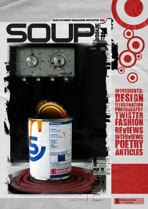